BudgetBites
Budget meal planner app
For this project, I really wanted to create something that I would personally use. As a university student, I felt one of my biggest struggles was home cooked meals.
Role
Product designer
Timeline
Jan - Mar '22


Defining student needs
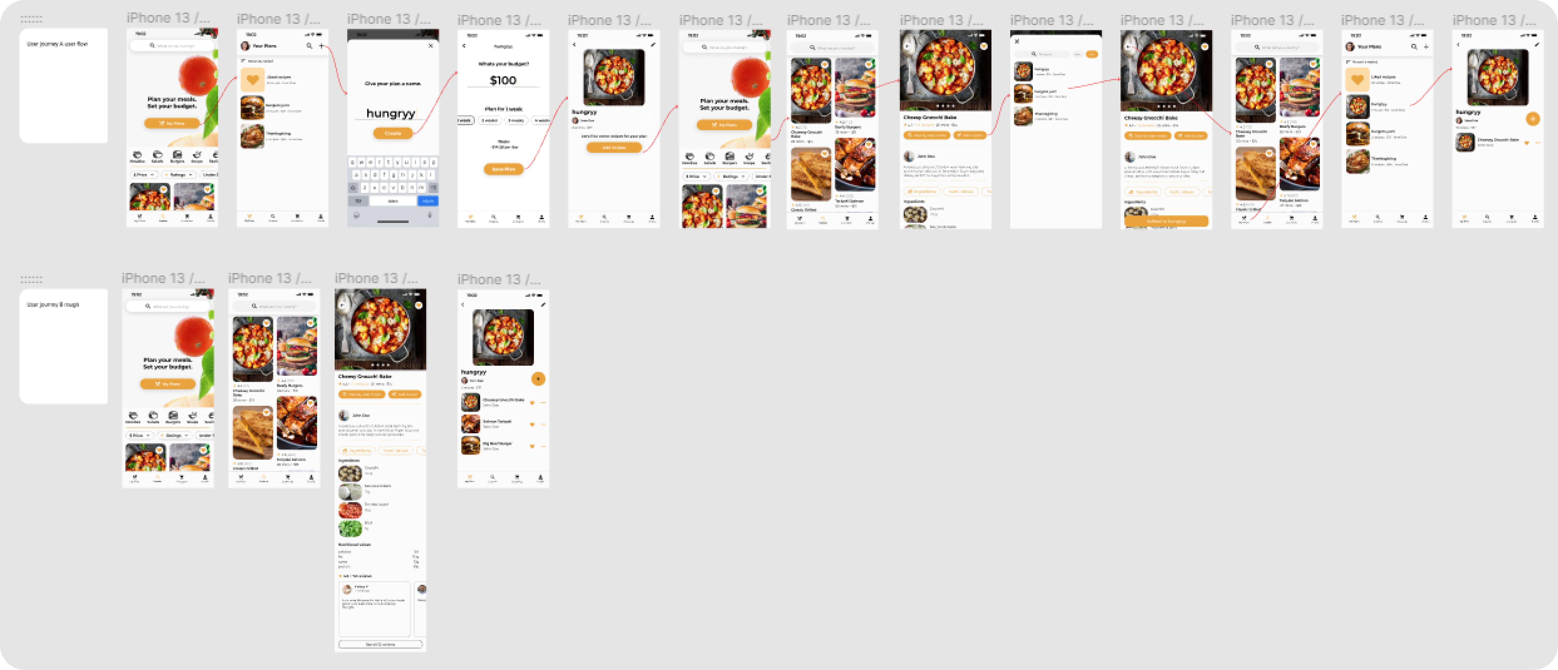
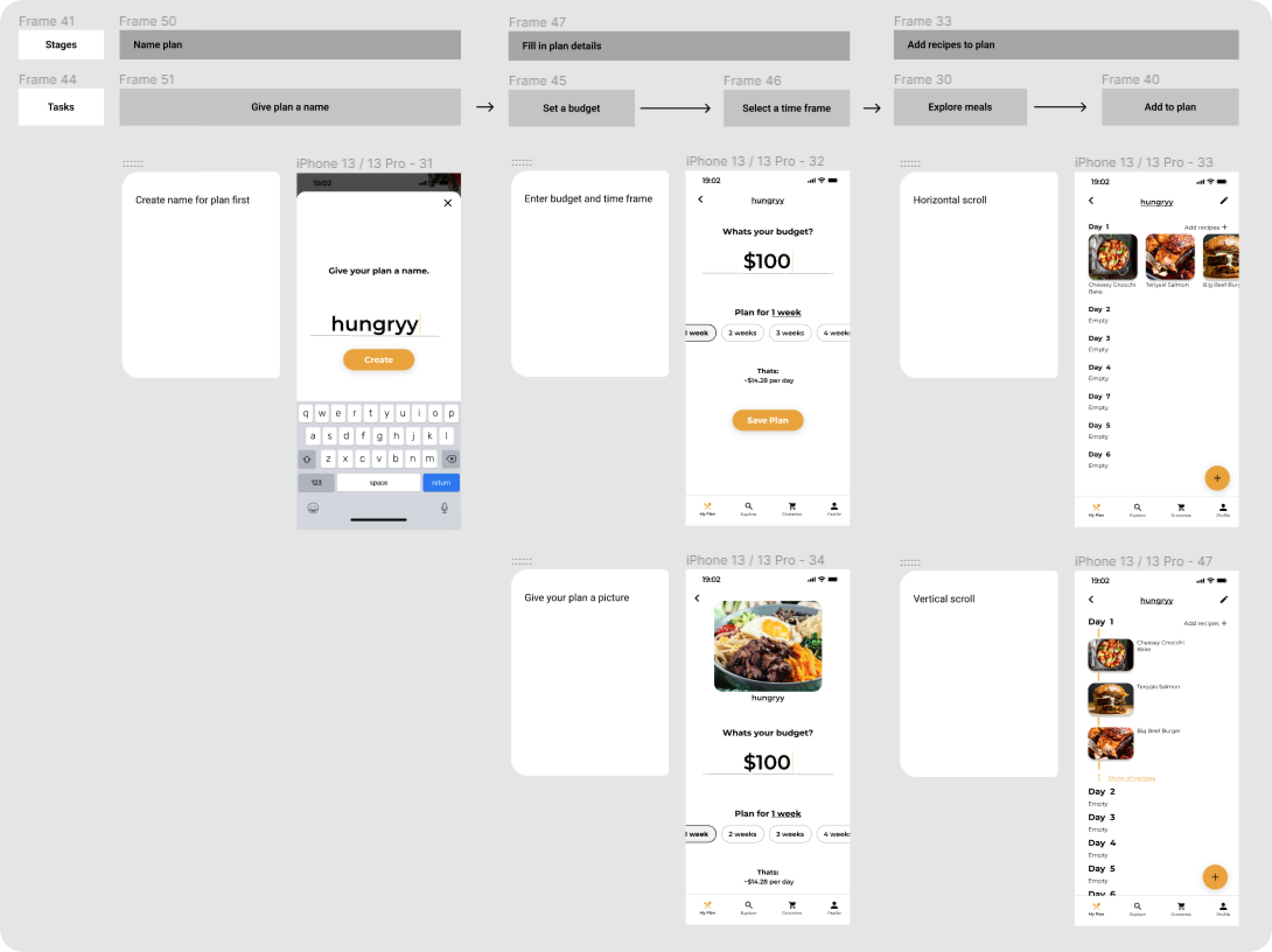
To better understand my audience, I interviewed 6 post-secondary students about their struggles with eating during school. Their main pain points were cost, time, energy, and not knowing what to make. From there, I analyzed similar products and mapped key user journeys to help shape the app’s direction and core features.
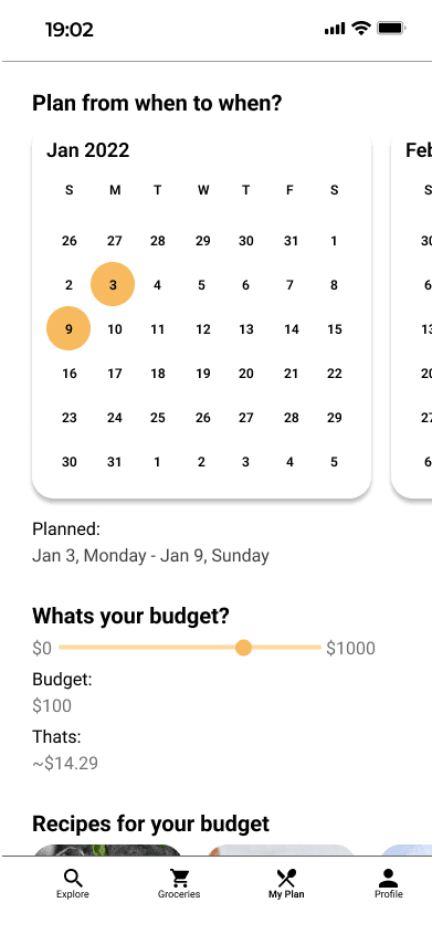
Too much planning
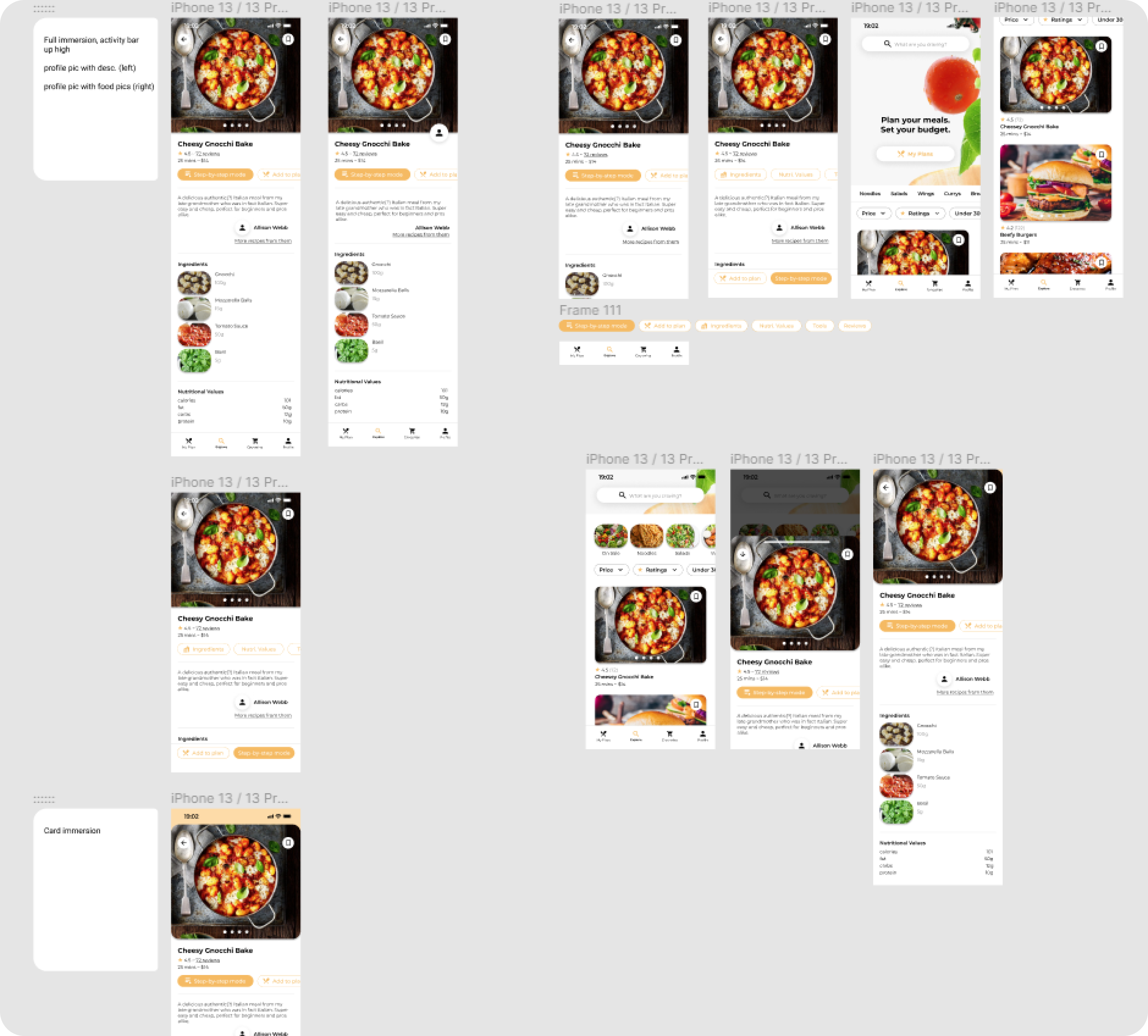
Early versions included grocery price comparisons and meal-by-day scheduling, but these features branched too far from the core problem. They made the app feel more complicated than it needed to be, especially for casual users who just wanted easier ways to find meals.
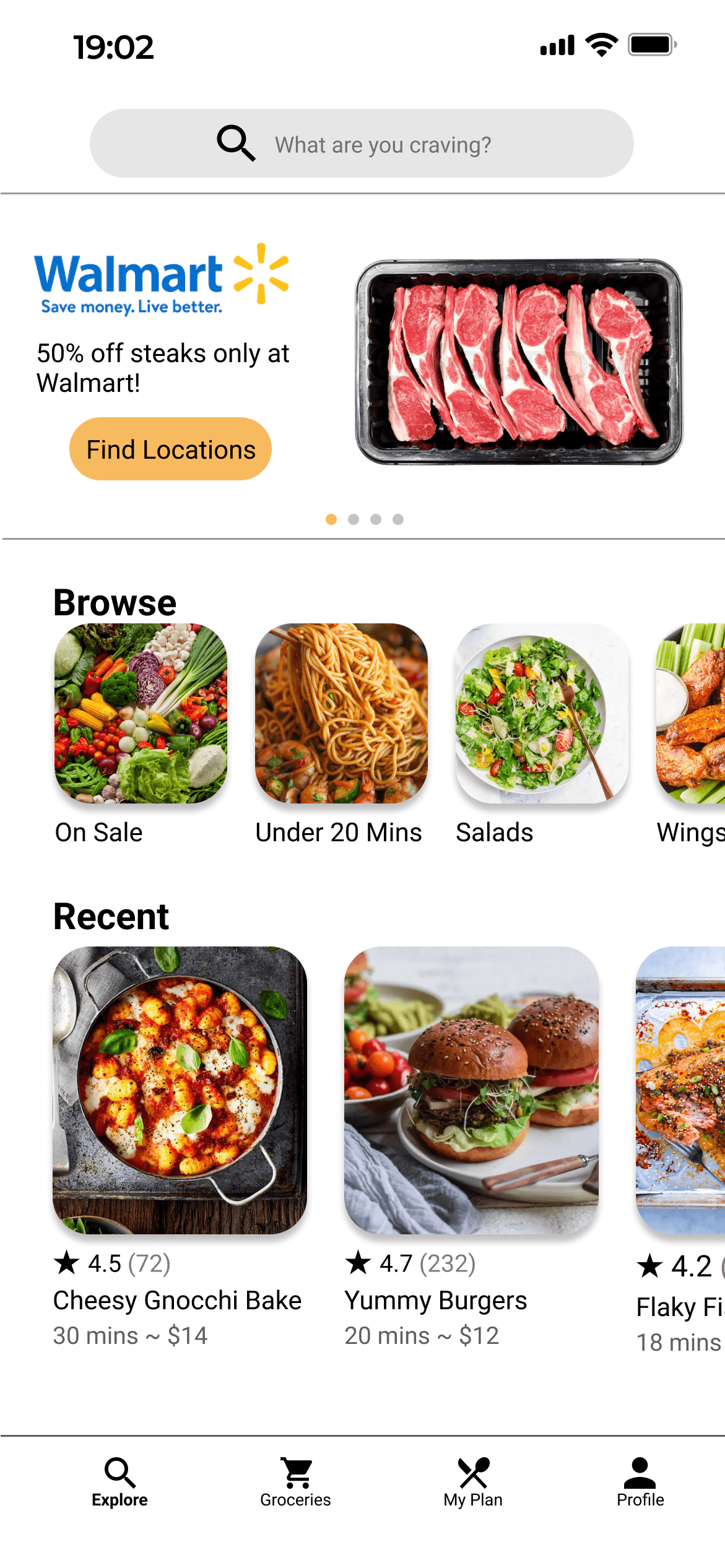
Faster decisions
Some early explorations used more creative inputs like calendars, scrollers, and a vertical explore feed. Testing showed that these made the experience slower than expected, so I simplified the flow and moved toward a masonry grid that let users see more at once and decide faster.