


Canadian Sheep Federation
Livestock management tool
Established in 1990, the Canadian Sheep Federation (CSF) represents the Canadian sheep industry and drives growth for lamb producers and new entrants. In Summer 2023, I worked cross-functionally AI sheep face tracking features, and led the design of an improved AgroLedger web app for livestock management, securing executive approval for the 2024 roadmap.
Role
UX/UI design intern
Team
2 designers, 2 AI engineers, 2 QA engineers, 5 SWEs, 1 project manager
Timeline
May - Jul '23
Livestock directory
Where farmers track their registered sheep from any of their premises. The redesign cuts extra features and adds two view options: card view for quick, visual browsing, and list view for a more info-packed, strategic overview.


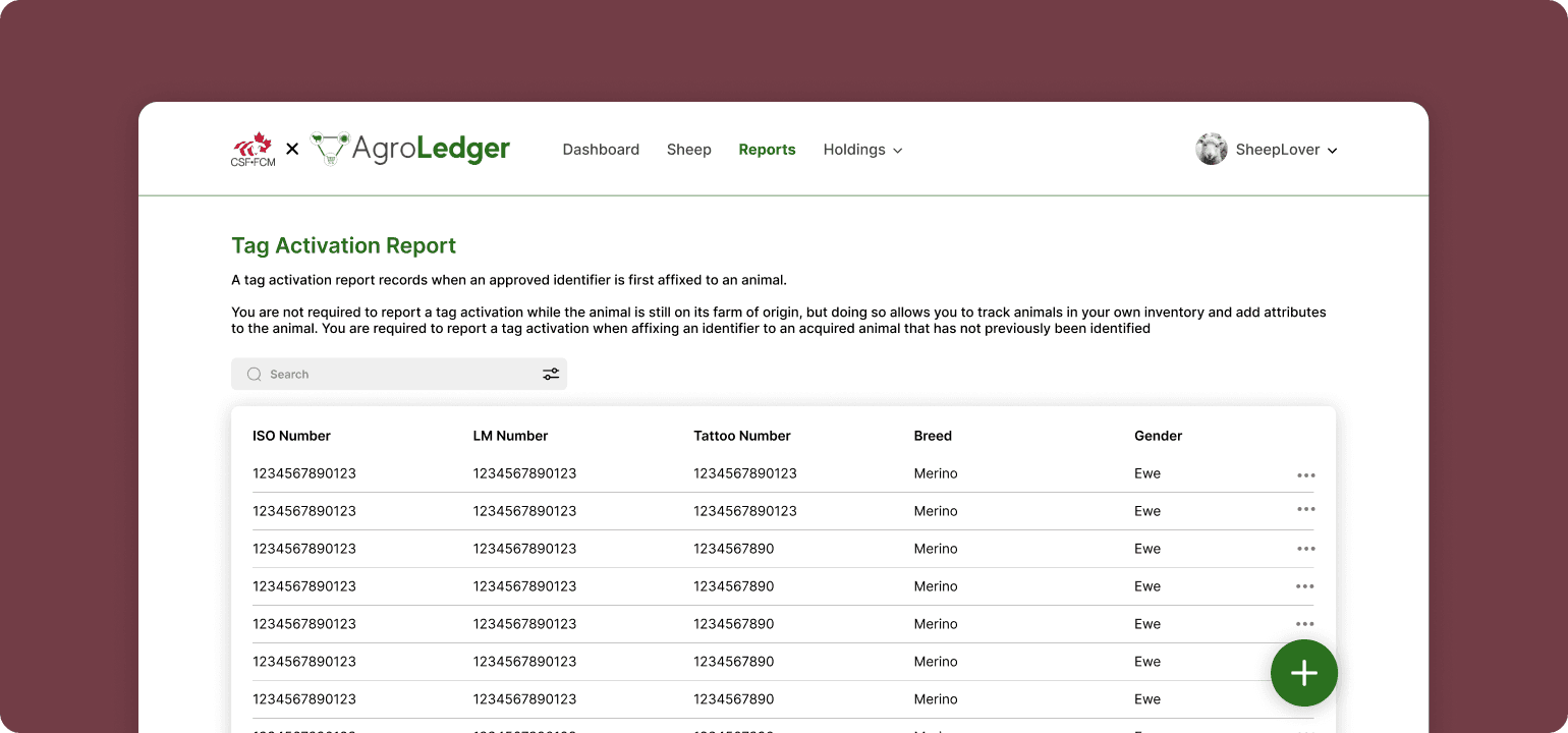
Reports
Farmers find relevant reports here. The new design adopts a consistent list component across the website, leveraging user familiarity to streamline interaction.

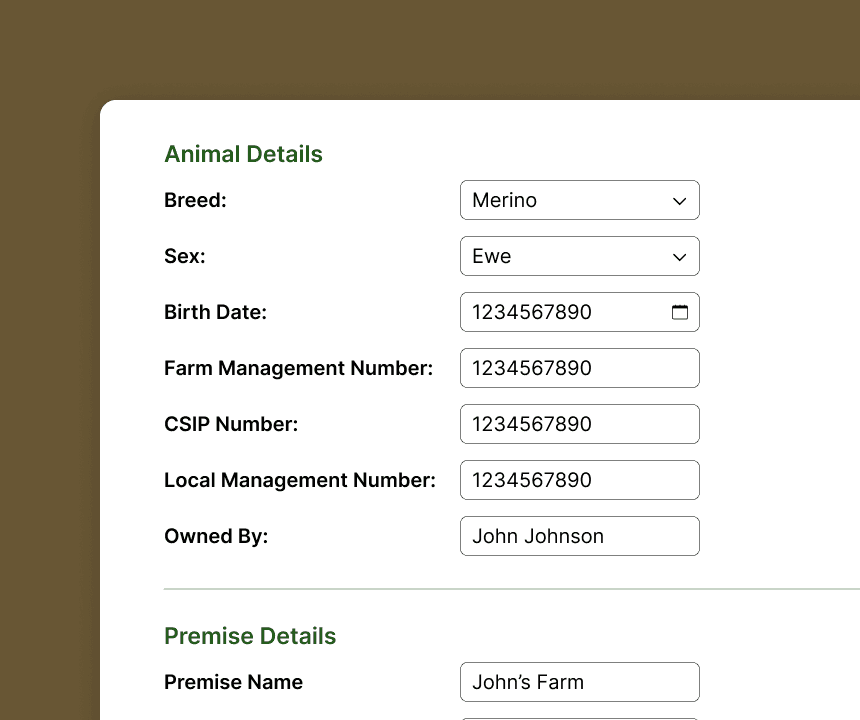
Livestock overview
Get a comprehensive overview of your registered sheep, including all their details, related reports and documents. The new redesign condenses unimportant information when not needed, and provides a more visual experience for easy reading and identification of crucial information.

Discovery and domain research
Leading the ideation and user research, it was important to familiarize ourselves with the current design of the web app and its functions, categorizing all the screens of the app, and commenting on areas of need. I had to learn the ins n' outs of sheep farming very quickly to understand the functions within the app, and empathize with the farmers on a deeper level.
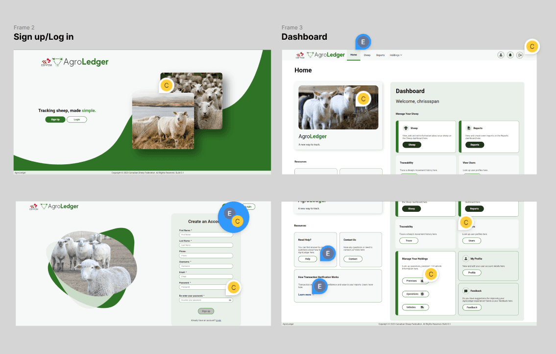

We continued by creating prototypes for what were the most important user tasks: signing up, registering livestock, and creating a new report.
Before and after
To land on my final designs, I went through multiple iterations and ideas. Check out some before-and-after's of the old designs vs. new ones.

Before
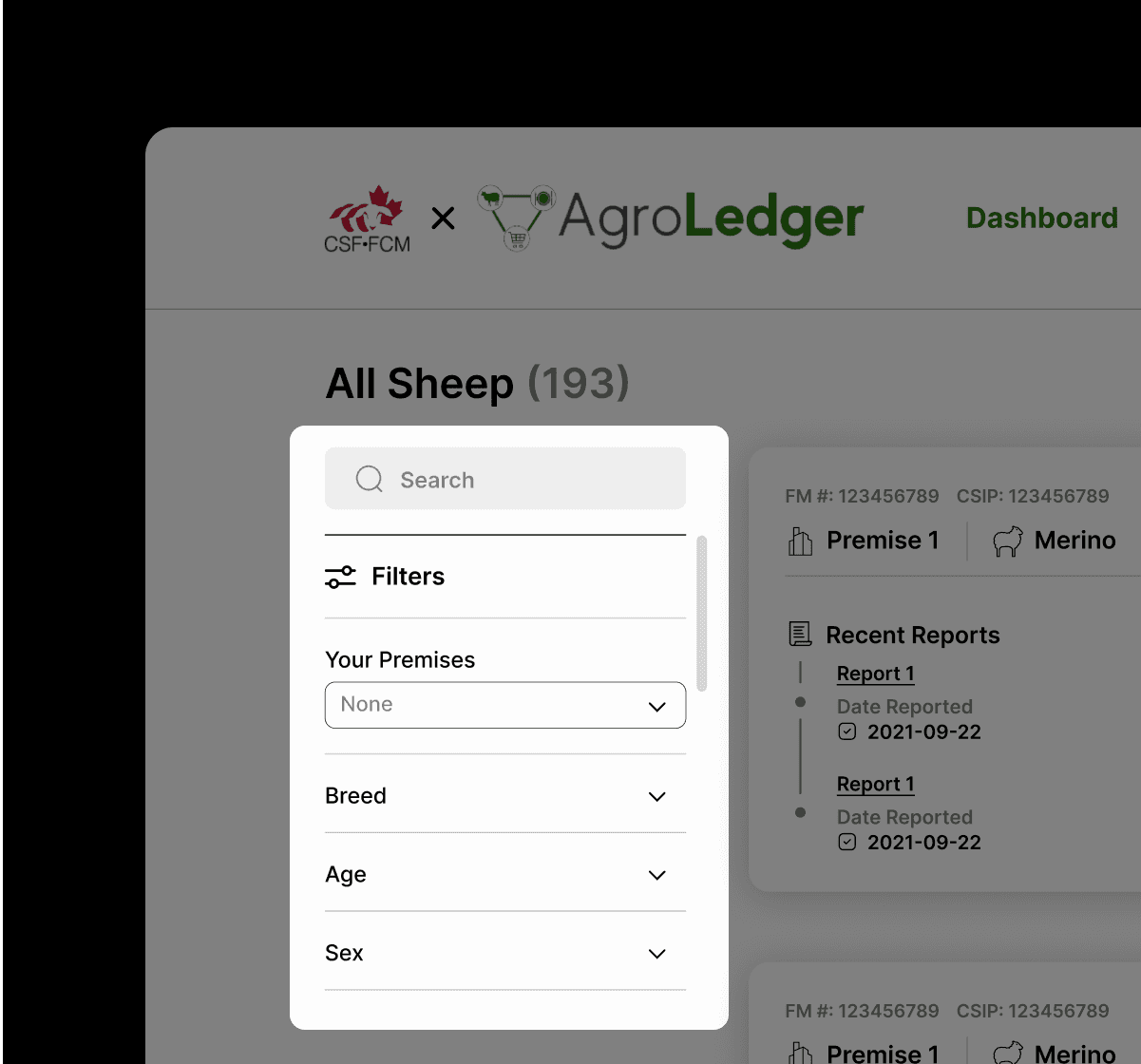
The previous iteration of the search and filtration feature lacked the necessary depth and specificity, making it challenging to conduct searches with ease. It also occupied an incredible awkward and large space.
After
The new design streamlines this feature, making for a more intuitive experience and providing deeper search options. This design also allows for scalability if new search filters need to be added.

Before
When adding new livestock, users were faced with options to both add individually or in bulk, leading to confusion for which to do, and taking up unnecessary real estate. No pun intended it also felt very "bulky".
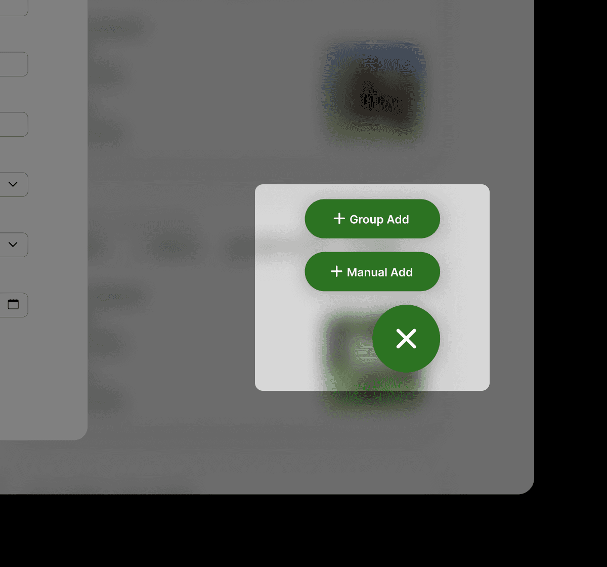
After
The new design, lessens the user's cognitive load, allowing them to choose only what they need. The user can easily switch forms, adding just one or multiple livestock.
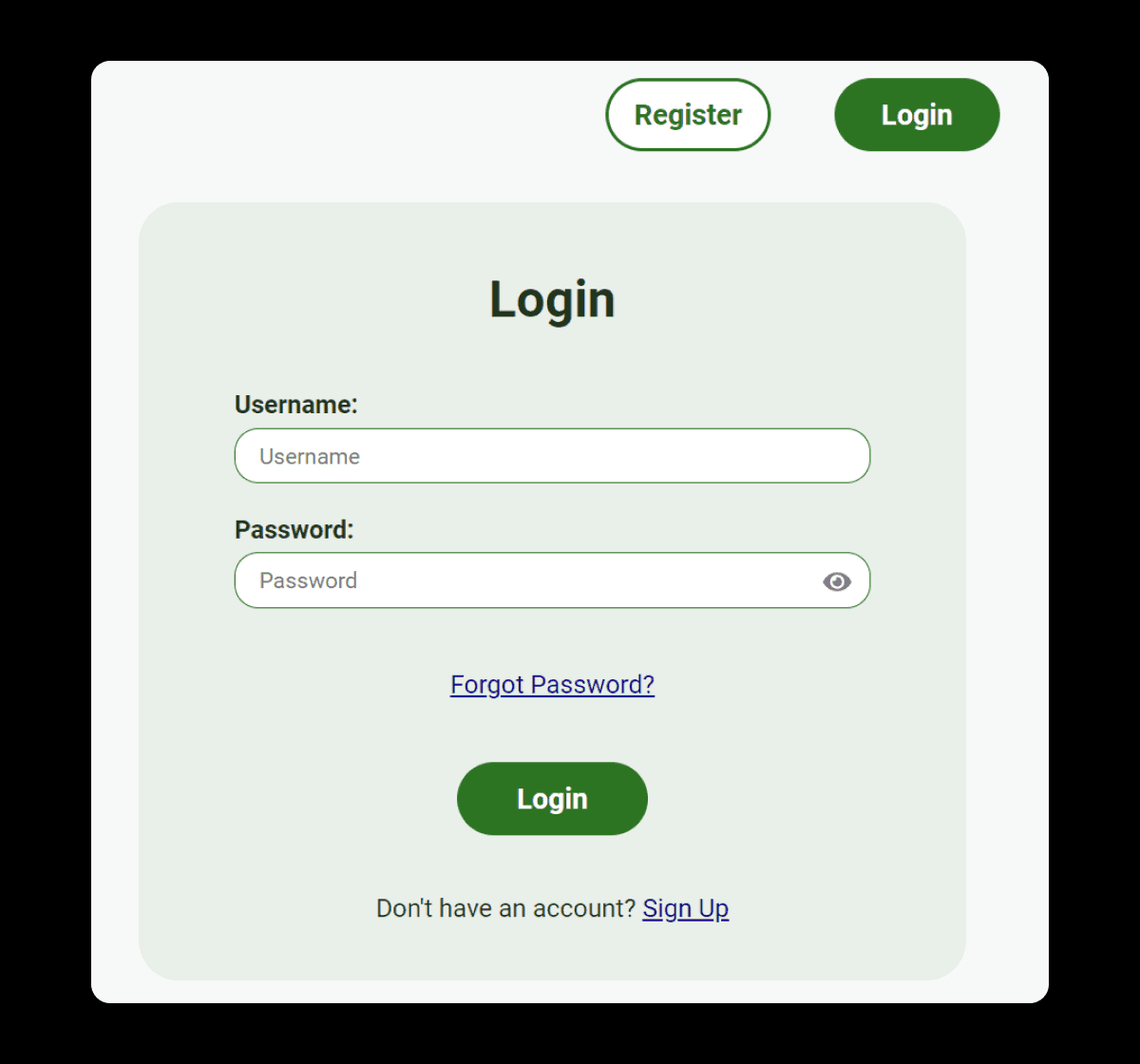
Before
The previous version of the login page was cluttered with multiple call-to-action buttons that essentially performed the same action, but due to their different labels, created confusion for users.
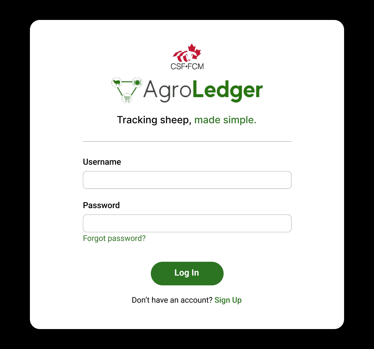
After
The new design cleans up the login page, and gives more context to new users about the tool. The new design also make this page, the first page users see, instead of providing an intermediary page to choose between sign up and log in.


