

JamParty
Social karaoke game app
Gaming has always been one of my biggest hobbies, and the way games design interaction and entertainment has strongly influenced my design approach. From COVID, I wanted to explore a new concept inspired by how my friends and I have always bonded through remote play (the world was just catching up). This project gave me a golden opportunity to sharpen my design process and experiment with new skills!
Role
Product designer
Timeline
May - Aug '22
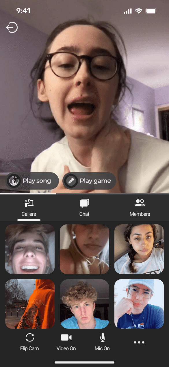
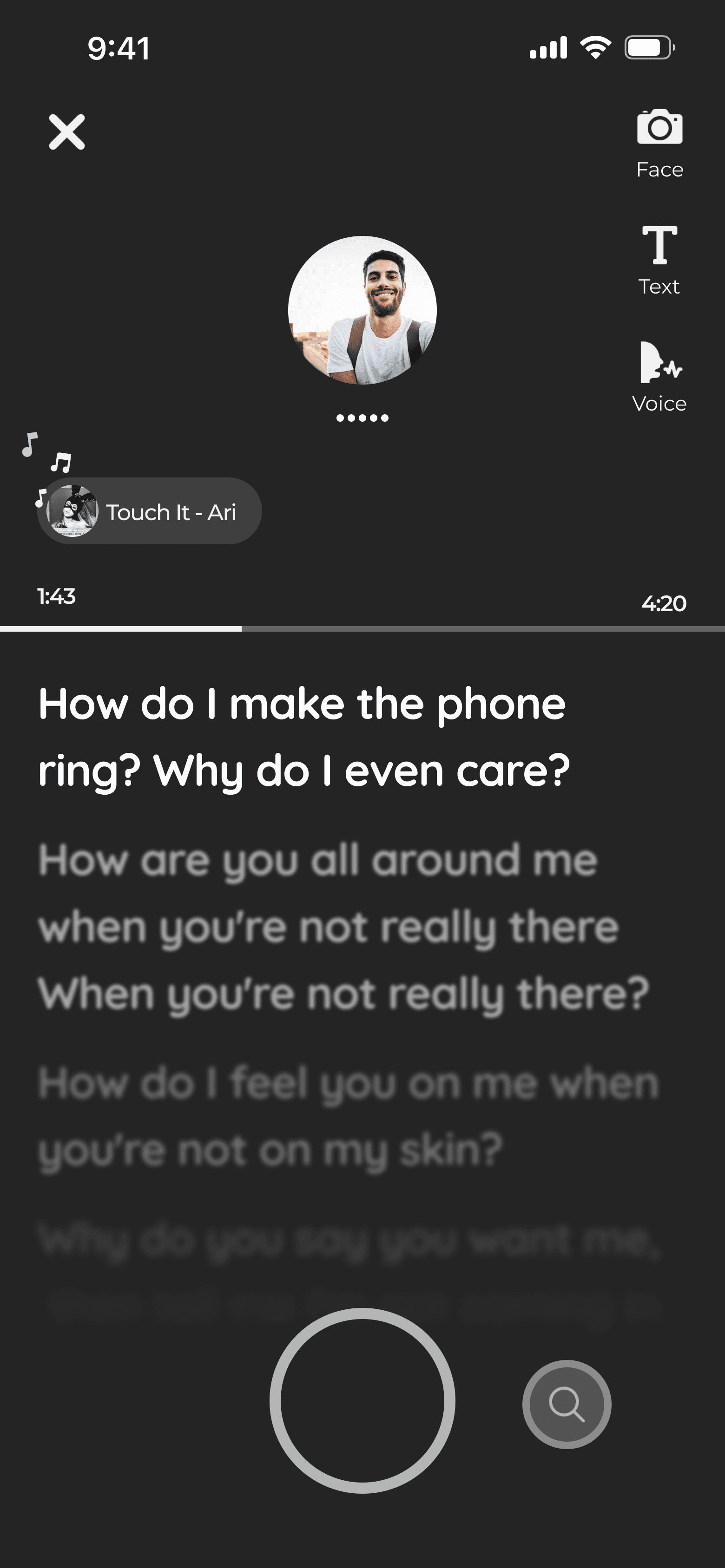
Jamming
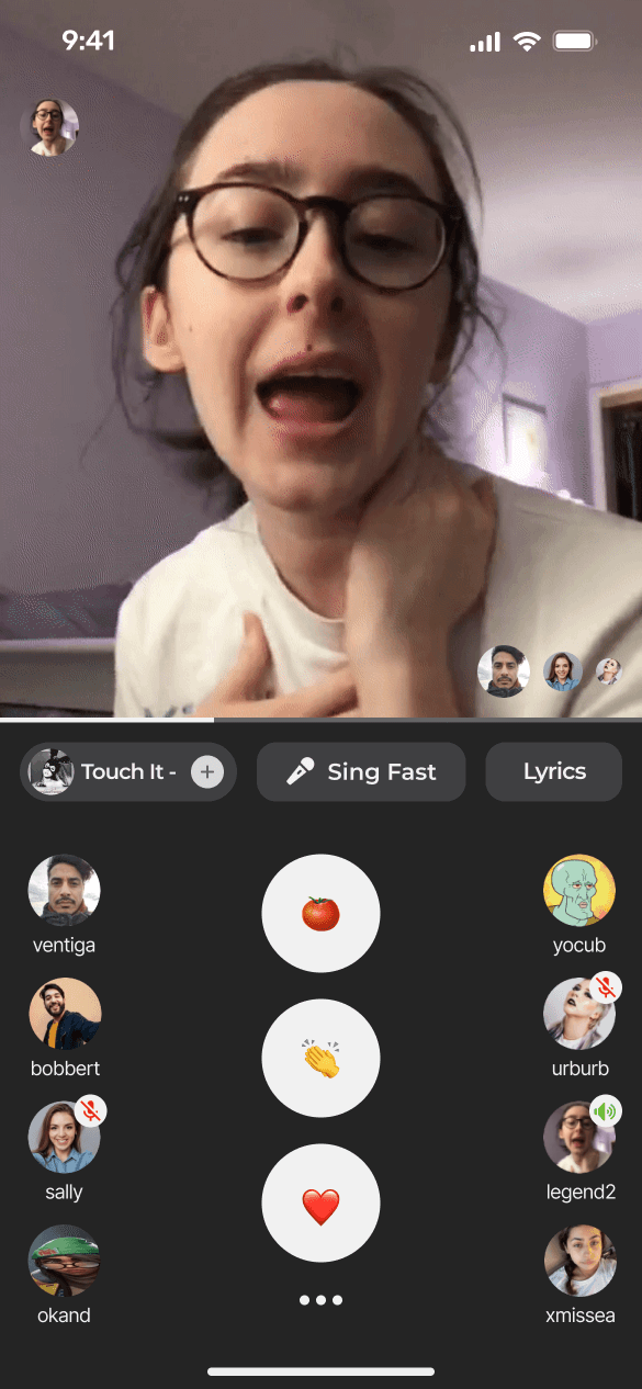
The meat and potatoes. An interactive karaoke room where friends group up to play games with their favourite songs. The screen is split into clear zones for actions, performers, song and game info, social activity, and a dynamic action bar that lets users smoothly move between video, chat, and extra options.


Connecting
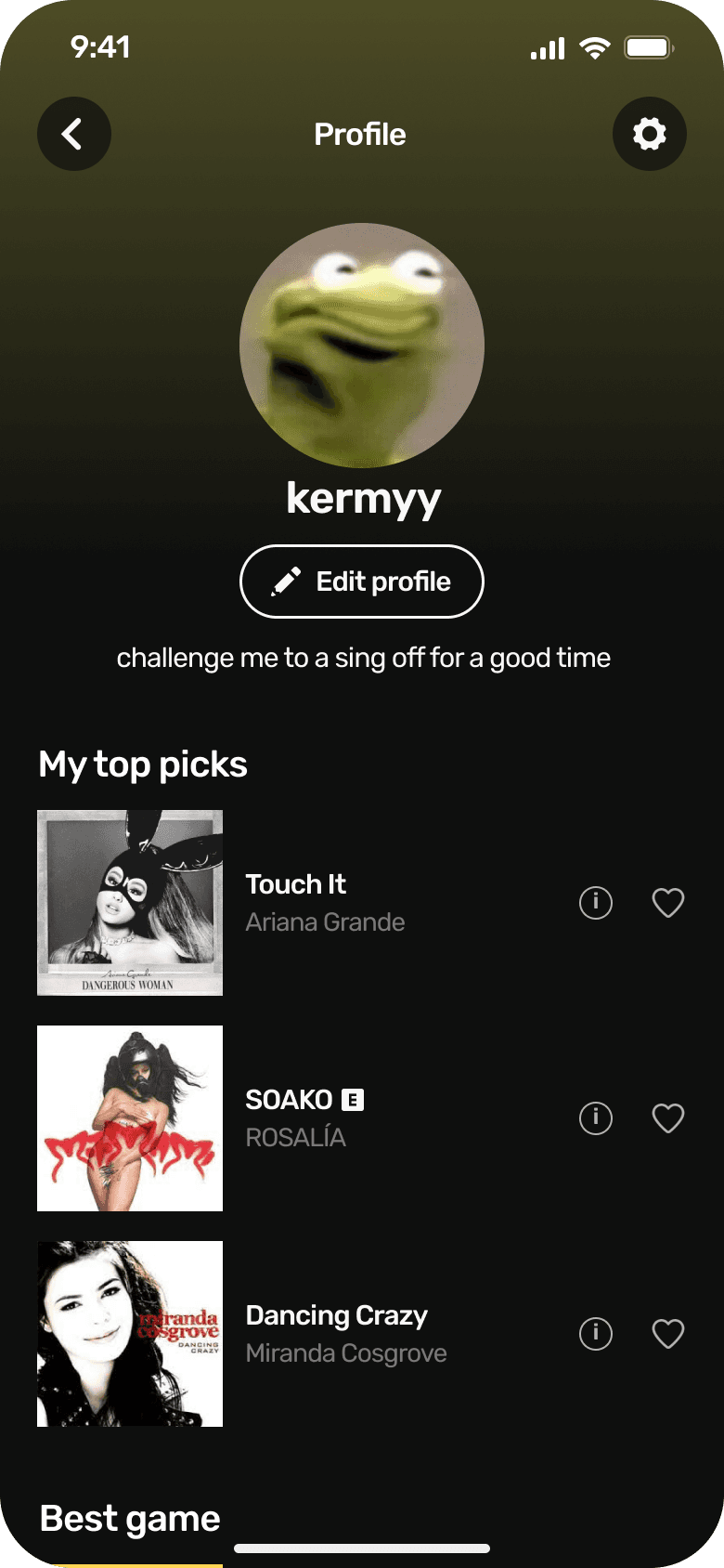
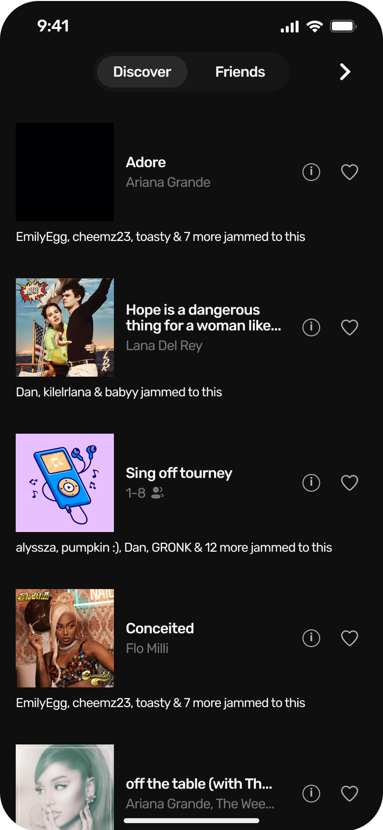
From the homepage, users can hop into their profile or social tab to see everything friend-related. Profiles show favourite songs, games, high scores, and stats, while the social pages let you discover what friends are jamming to, join or judge them, and manage friend requests.

Creating
Explore everything JamParty has to offer while you’re solo. Sing your favourite songs, play solo games, pop open lyrics when you forget the words, and discover new songs and games to share with friends.


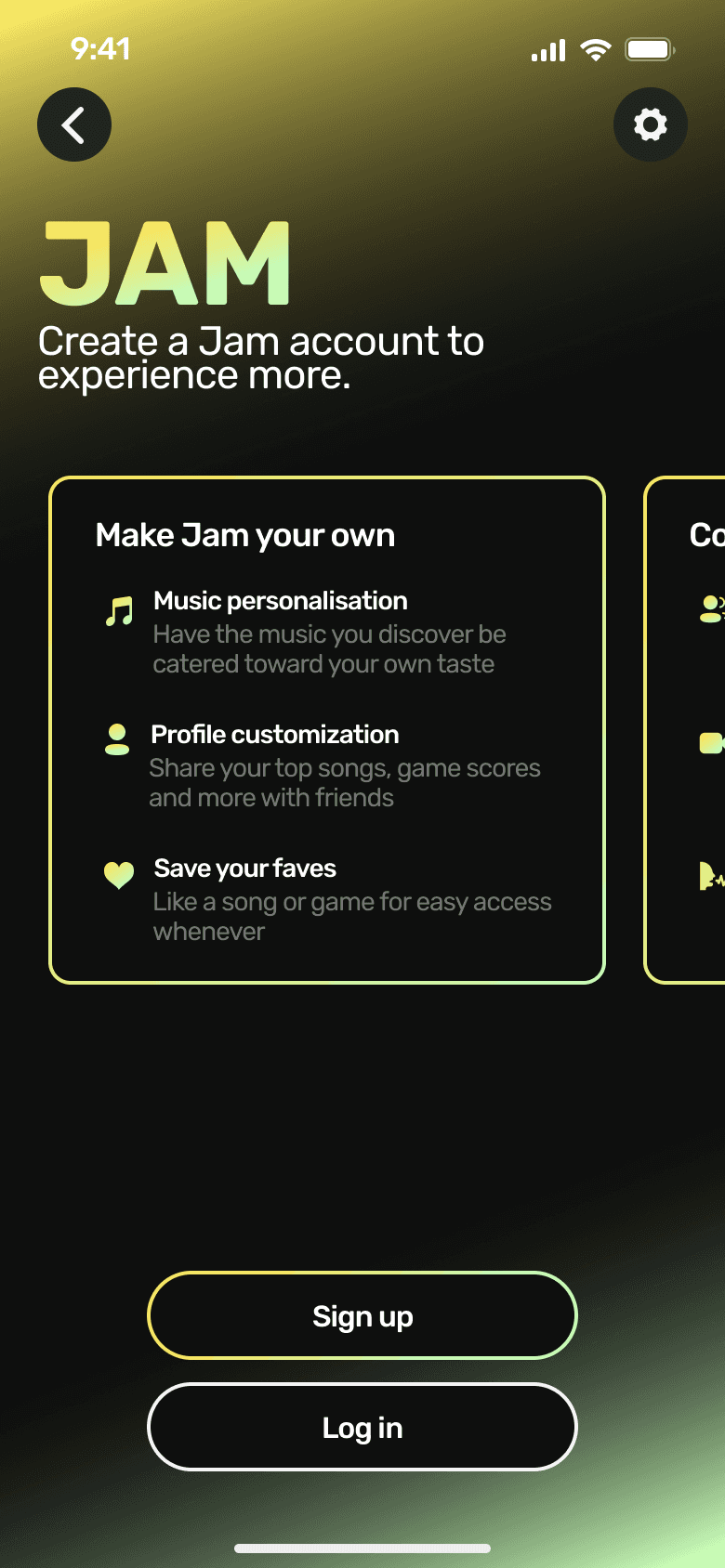
Onboarding
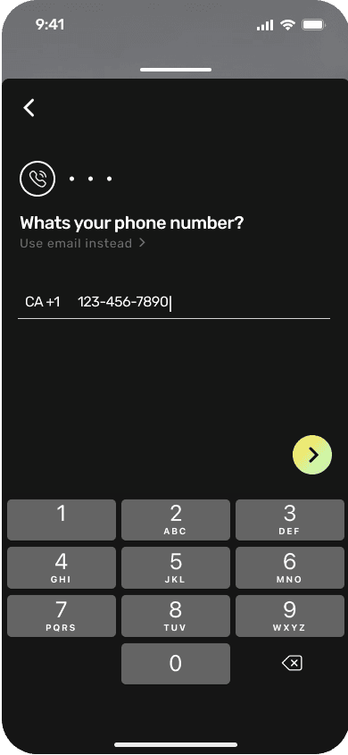
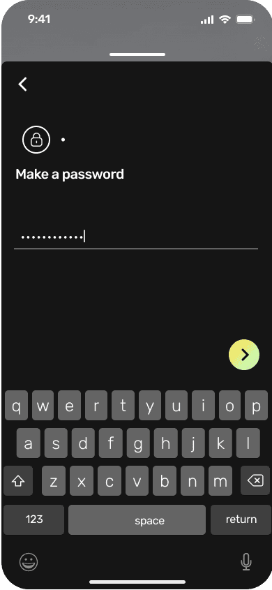
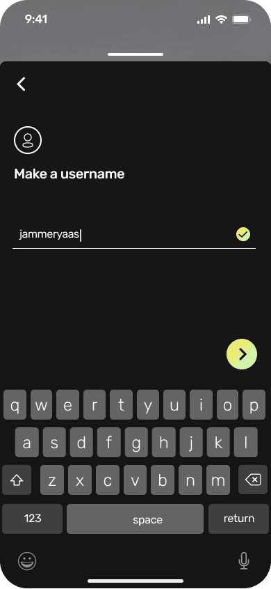
Try songs, games, and join Jams before having to signup. No-account users get a preview of what they’re missing, and when they’re ready, the sign-up flow only asks for the essentials so they can start jamming ASAP.

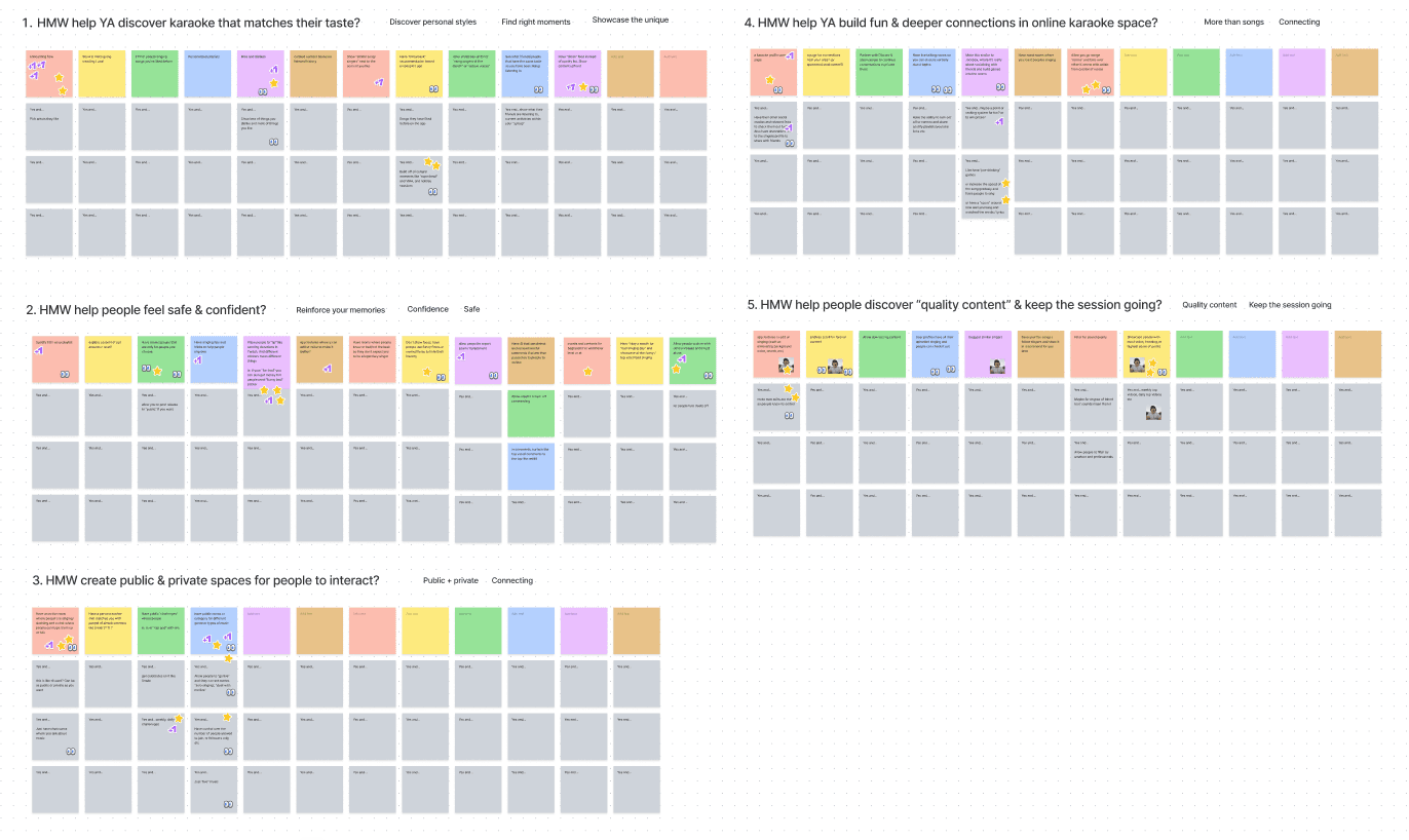
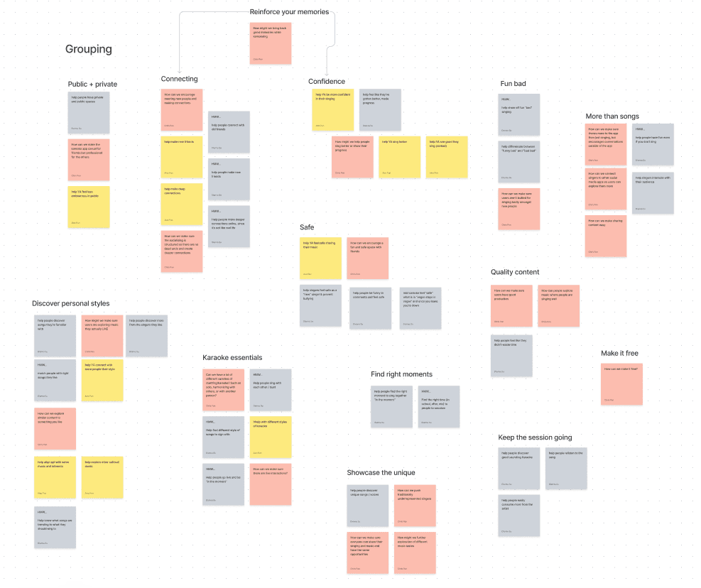
How might we?
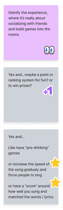
From these HMW's, different solutions and opportunities were conceptualized, and continuously added onto through a "Yes and…" exercise. Finally, the most popular concepts were voted on.
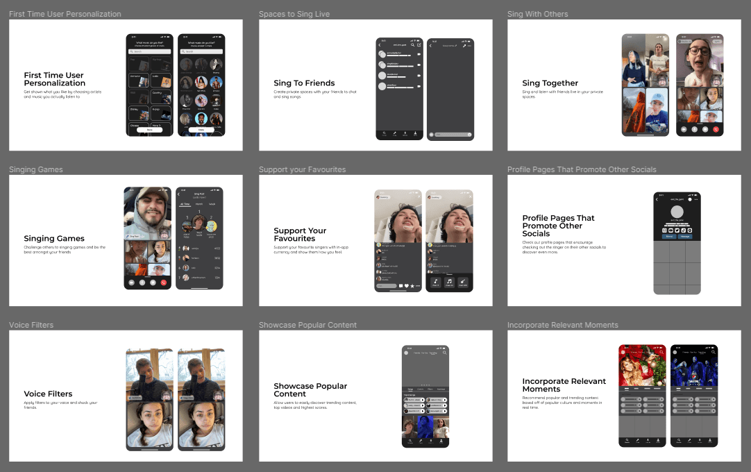
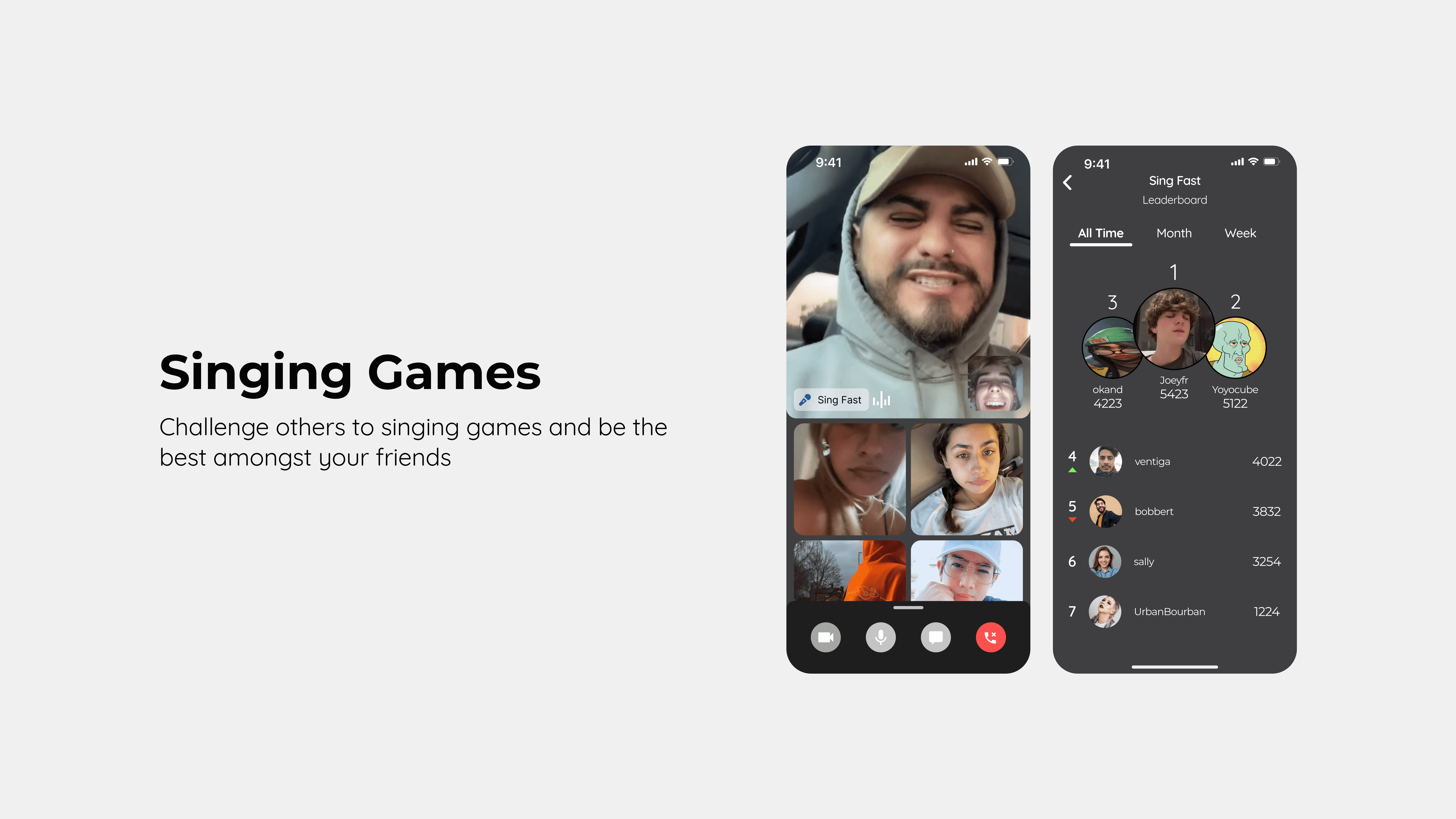
Concept billboards
I then created lo-fi billboards for the top 9 concepts and used them in user research to validate which ideas felt the most valuable.

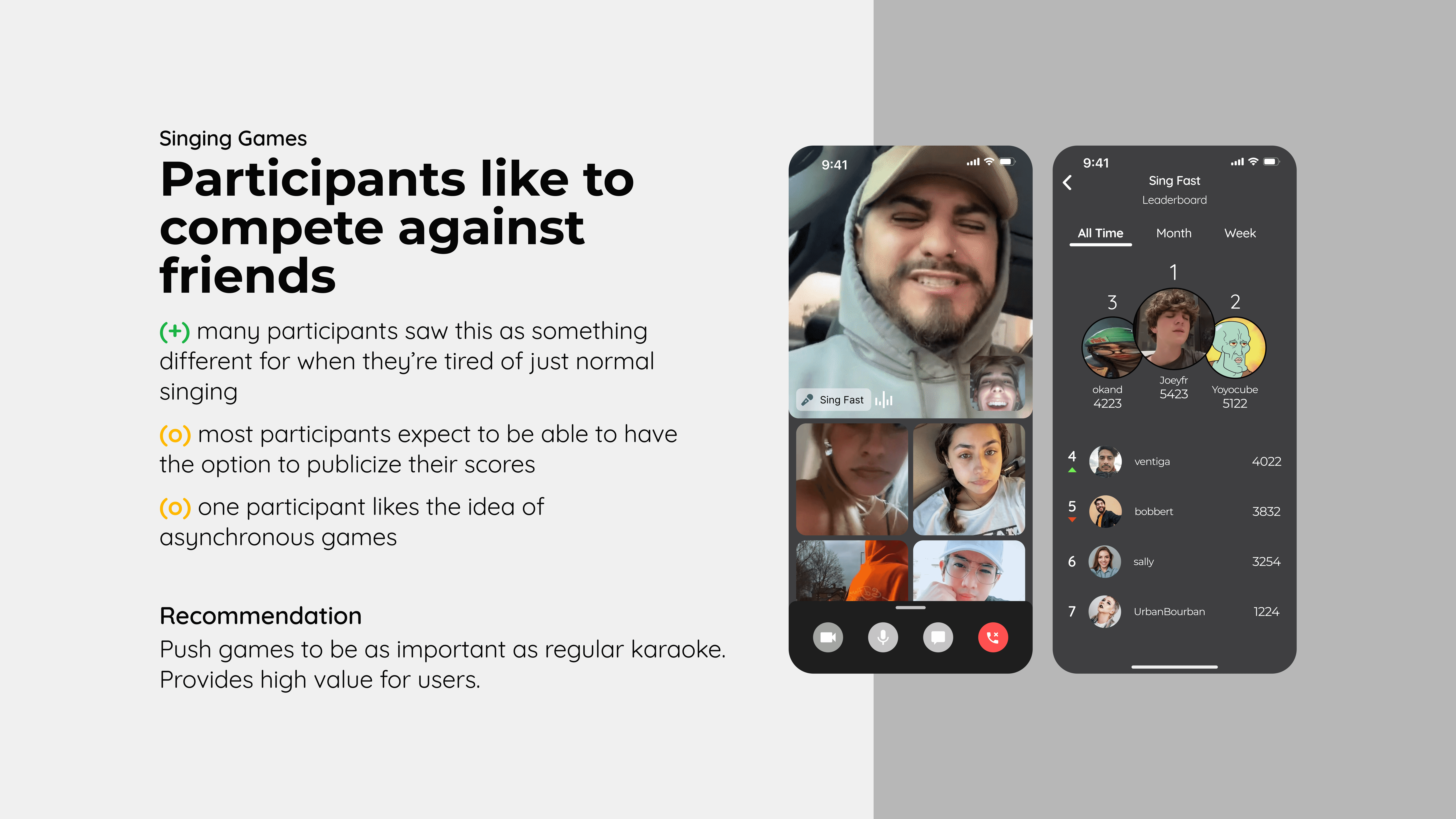
UXR summaries
After, I interviewed 9 participants about their goals, reactions, and what felt useful, while also testing usability when possible. I then turned the feedback into UXR summaries for each concept, covering key positives, neutrals, negatives, and any recommendations moving forward.
Jam room layouts
The Jam room and creation experience lived many lives from performer-focused layouts to more anonymous or action-heavy screens. These directions helped me realize the experience worked best when it felt face-forward, expressive, and easy to read, instead of overly focused on one performer or crowded with competing actions.
Onboarding & social
I explored a few ways to make onboarding and sharing feel more exciting, from social posts to progress indicators and sign-up prompts. While the ideas helped surface what the app could offer, they started to feel too heavy, forced, or disconnected from the quick, playful energy I wanted JamParty to have.


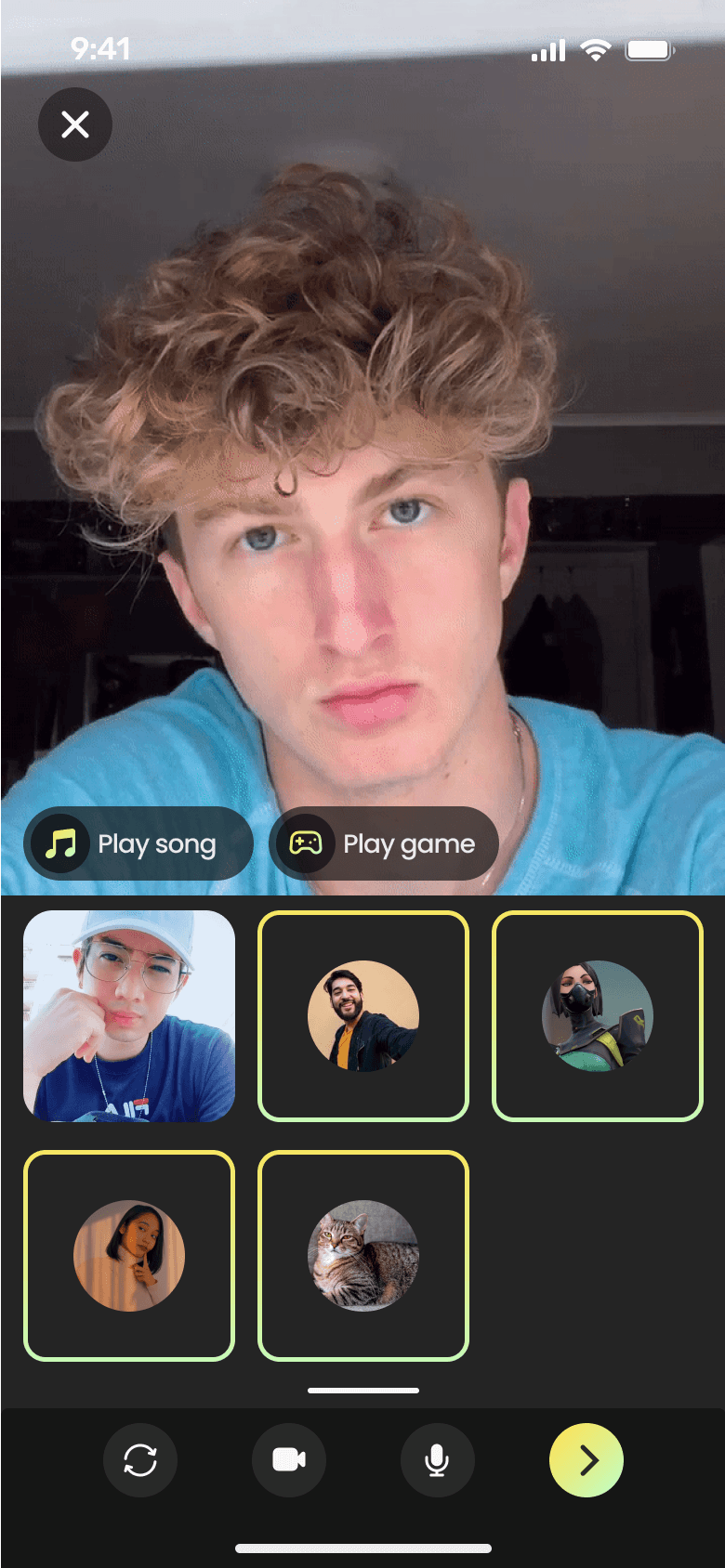
Inviting others to a jam
My first invite flow separated recent calls from creating a new call, which made starting a group feel more complicated than it needed to be. I later simplified the flow for quicker, more casual interactions, and changed profiles from real names and usernames to usernames only to better fit JamParty’s game-like social style.
Reactions mid-game
I explored a few ways for users to access reactions during a Jam for some playful expression. The wheel had the right fun, game-like feeling, while the horizontal list felt more familiar and comfortable. Combining the two helped make reactions feel expressive without making them harder to use.


Reflection and takeaways
What I learned from this project.
I love motion!
This project was an incredibly vigorous experience where I was able to hone many different skills and also discover my passion for animation and deeper prototyping! They breathe so much life into ideas!
Keep organized
This project was larger than I first expected, and my files weren't the most organized or easy to keep up with. I definitely need to keep neater next time.
Set priorities
I had a lot of cool ideas but had to learn to prioritize the most important features and parts of the designs first. Adjustable camera positions and sizes during a jam, copying a friend's voice as a filter, and introducing more exclusive games are just some of the exciting possibilities I'd love to explore in the future.