


TELUS Digital
Enterprise AI & foundational design system
TELUS Digital (Previously WillowTree) is a digital product consultancy working with large, complex organizations across industries. During my time there, I worked within Fuel iX, a multi-product ecosystem where teams shipped in parallel and design maturity varied across products. I worked on new workflows for Copilot, an enterprise AI chat, and tackled long-standing visual and interaction inconsistencies cross-product
Role
Product design intern
Timeline
May - Aug '25
Copilot
MCP management dashboard
I led the design of a new feature supporting the launch of MCP capabilities in Copilot AI. This required designing while the system itself was still evolving, with frequent iteration and ongoing updates as both matured together.
Motion as system feedback
Movement was core to this design. High-fidelity prototypes explored how admins move between integrations, the marketplace, and app usage. Smooth, continuous transitions kept context while making the system feel fast and responsive.
AI activity log
Admins can monitor individual/team usage of connected apps via MCP through a centralized, resizable panel that logs AI-initiated interactions, including the user, connected product, triggering message, and timestamp.


App marketplace & access requests
This marketplace lets admins/privileged users browse apps that can be introduced into the organization via MCP. A requests tab allows teams/members to propose new connections with context on intended use.
Cross-product
Foundational design system
In parallel with the MCP feature, I led foundational design system work for Fuel iX, spanning multiple products within a large-scale ecosystem. The focus was on defining shared foundations that enable alignment and scalability, creating a strong base for teams to build and extend components in the future. Most of my time was spent on colours.


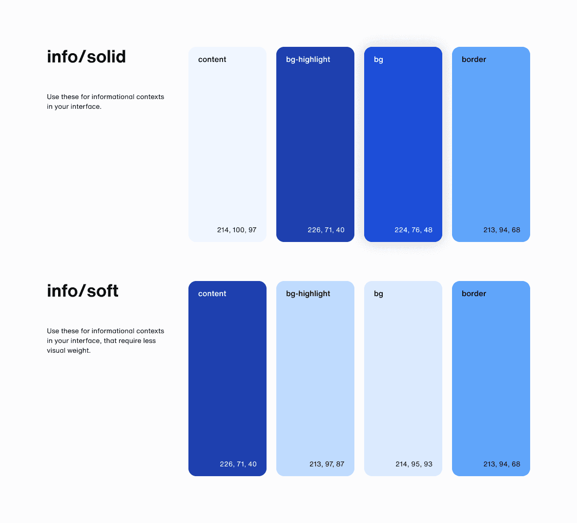


I reviewed four products to audit colour usage across the suite. By tracking shared colours and their roles in each product, I compared patterns and uncovered inconsistent, seemingly random applications that revealed gaps in system-level guidance.
